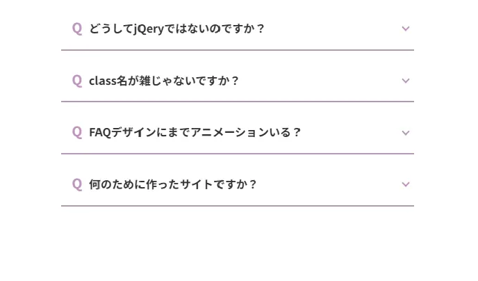
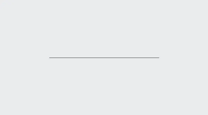
複数のCSSアニメーションとSVGのループアニメーションを加えたリッチなメインビジュアルアニメーション。
複雑なアニメーションに見えて実はHTMLとCSSのみで、軽量なのにまるで動画のようなメインビジュアル。
HTML
<div class="mv mv2">
  <div class="mv2__contents">
    <p class="mv2__txt">Change Your Life<br>with Web Animation!</p>
  </div>

  <svg class="mv2__svg" viewBox="0 0 1920 1047" fill="none" xmlns="http://www.w3.org/2000/svg" preserveAspectRatio="xMidYMid slice">
  <g clip-path="url(#clip0_33_70)">
  <mask id="mask0_33_70" style="mask-type:alpha" maskUnits="userSpaceOnUse" x="-196" y="-153" width="2258" height="1545">
  <path class="mv2__path" d="M-75.8586 893.265C401.081 893.265 589.211 489.362 775.934 154.726C775.934 154.726 833.075 554.683 1177.9 709.029C1458.35 834.559 1959.51 468.167 1959.51 468.167" stroke="white" stroke-width="200" stroke-linecap="round"/>
  <path class="mv2__path delay1" d="M-95 654.806C183.834 363.141 488.813 252.916 740.842 223.318C992.87 193.72 1161.95 348.533 1161.95 348.533C1476.19 595.776 1502.51 1132.54 1442.69 1291.26" stroke="white" stroke-width="200" stroke-linecap="round"/>
  <path class="mv2__path delay2" d="M-82.2391 0C130.709 425.896 280.318 751.457 759.185 886.088C1009.59 956.489 1200.23 963.168 1453.06 865.351C1693.63 772.282 1961.9 514.425 1961.9 514.425" stroke="white" stroke-width="200" stroke-linecap="round"/>
  </mask>
  <g mask="url(#mask0_33_70)">
  <rect x="-1" width="1920" height="1047" fill="#D9D9D9"/>
  </g>
  </g>
  <g mask="url(#mask0_33_70)">
  <image
    href="/animation/wp-content/uploads/2026/01/bg.jpg"
    x="-1" y="0"
    width="1920" height="1047"
    preserveAspectRatio="xMidYMid slice"
  />
  </g>
  </svg>
</div>
CSS
.mv2 {
  background-color: #EAEBEF;
  position: relative;
  width: 100%;
  overflow: hidden;
}
.mv2__contents {
  display: flex;
  align-items: center;
  justify-content: center;
  position: absolute;
  top: 0;
  left: 0;
  width: 100%;
  height: 100%;
  background-color: #EAEBEF;
  animation: bgAnime 1s ease 1s forwards;
}
@keyframes bgAnime {
  0% {
    background-color: #EAEBEF;
  }
  100% {
    background-color: transparent;
  }
}
.mv2__contents:before {
  display: block;
  content: "";
  position: absolute;
  top: 0;
  right: 0;
  bottom: 0;
  left: 0;
  margin: auto;
  width: 0%;
  height: 1px;
  background-color: #000;
  animation: lineAnime 1s ease forwards;
}
@keyframes lineAnime {
  0% {
    width: 0%;
  }
  100% {
    width: 90%;
  }
}
.mv2__txt {
  font-weight: bold;
  text-align: center;
  width: 100%;
  left: 0;
  line-height: 2;
  font-size: 30px;
  z-index: 10;
  color: #000;
  transform: scaleY(0);
  animation: txtAnime 1s ease .5s forwards;
}
@keyframes txtAnime {
  0% {
    transform: scaleY(0);
  }
  100% {
    transform: scaleY(100%);
  }
}
.mv2__svg {
  height: 100vh;
  width: 100%;
  vertical-align: bottom;
}
.mv2__path {
  stroke-dasharray: 3000;
  stroke-dashoffset: 3000;
  animation: svgAnime 9s ease-in-out infinite;
}
@keyframes svgAnime {
  0% {
    stroke-dashoffset: 3000;
  }
  33.3% {
    stroke-dashoffset: -3000;
  }
  100% {
    stroke-dashoffset: -3000;
  }
}
.mv2__path.delay1 {
  animation-delay: 3s;
}
.mv2__path.delay2 {
  animation-delay: 6s;
}
Change Your Life
with Web Animation!


コメント