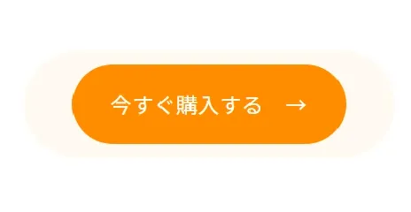
無限ループでボタンが波紋のように広がるアニメーション。
LPなどのCTAにおすすめのボタン。
コピペで簡単に初心者でも実装できるアニメーションなのに、このアニメーションをつけるだけででCV率に変化が。
HTML
<a class="ugkBtnRipple" href="#">
  <span class="ugkBtnRipple__wave first"></span>
  <span class="ugkBtnRipple__wave second"></span>
  今すぐ購入する →
</a>
CSS
.ugkBtnRipple {
  width: 200px;
  max-width: 100%;
  height: 60px;
  display: inline-flex;
  align-items: center;
  justify-content: center;
  color: #fff;
  background-color: #FF8800;
  text-decoration: none;
  border-radius: 100px;
  position: relative;
  transition: all ease .5s;
}
.ugkBtnRipple:hover {
  letter-spacing: 0.08em;
  opacity: 0.8;
}
.ugkBtnRipple__wave {
  display: block;
  content: "";
  position: absolute;
  top: 0;
  left: 0;
  width: 100%;
  height: 100%;
  border-radius: 100px;
  background-color: #FF8800;
  opacity: 0.4;
  z-index: -1;
  animation: ugkBtnRipple infinite ease 1.5s;
}
@keyframes ugkBtnRipple {
  0% {
    transform: scale(1);
    opacity: 0.4;
  }
  100% {
    transform: scale(1.4);
    opacity: 0;
  }
}
.ugkBtnRipple__wave.second {
  animation-delay: .4s;
}


コメント