
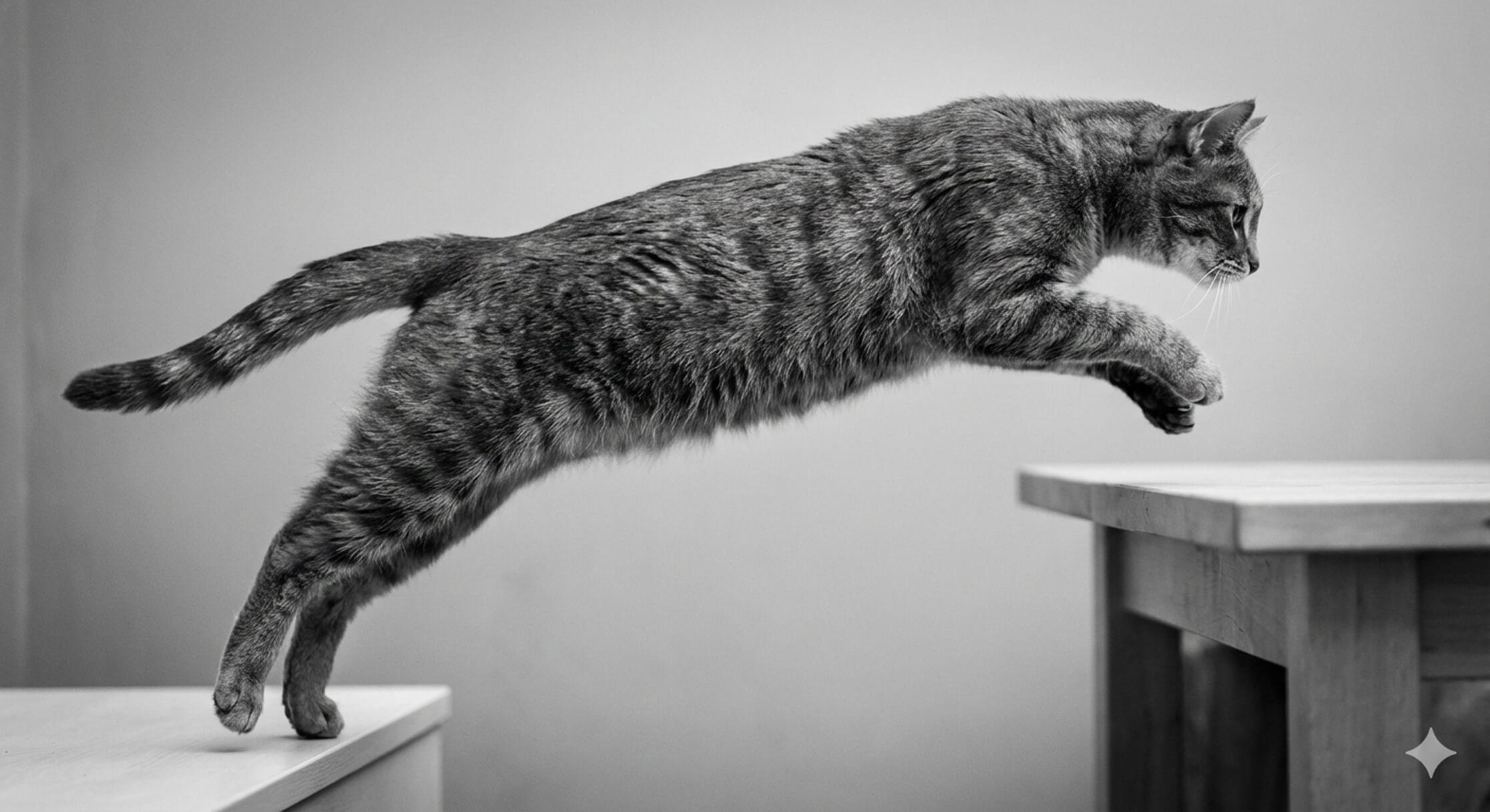
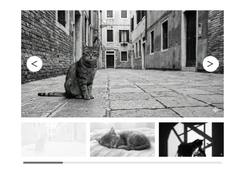
スライダーとSVGアニメーションを組み合わせたメインビジュアルアニメーション。
clip-pathの動きも加わり全体のバランスをとることで簡単なコードのみでもハイクオリティなヒーローイメージに。
※モーダル表示のため、スライダーが正常作動しない時があります。通常の使用方法では問題ない想定です。
HTML
<!-- 事前に読み込むもの -->
<link rel="stylesheet" href="https://cdnjs.cloudflare.com/ajax/libs/Swiper/11.0.5/swiper-bundle.min.css">
<script src="https://cdnjs.cloudflare.com/ajax/libs/Swiper/11.0.5/swiper-bundle.min.js"></script>

<div class="mv mv1">
  <div class="mv1__bg">
    <div class="mv1__slider">
      <div class="swiper-area">
        <div class="swiper mv1__swiper">
          <!-- Swiper wrapper -->
          <div class="swiper-wrapper">
          <!-- Slides -->
            <div class="swiper-slide">
              <img src="/animation/wp-content/uploads/2026/01/img1.jpg" alt="">
            </div>
            <div class="swiper-slide">
              <img src="/animation/wp-content/uploads/2026/01/img3.jpg" alt="">
            </div>
            <div class="swiper-slide">
              <img src="/animation/wp-content/uploads/2026/01/img2.jpg" alt="">
            </div>
          <!-- /Slides -->
          </div>
        <!-- /Swiper wrapper -->
        </div>
      </div>
    </div>

    <svg class="mv1__svg" width="2860" height="854" viewBox="0 0 2860 854" fill="none" xmlns="http://www.w3.org/2000/svg">
    <g clip-path="url(#clip0_8522_6707)">
    <path class="mv1__path" d="M2808 -43.5C2685 92 2334 334.5 2133.5 436.5C1464 775 955.5 725.5 915.5 526C895.751 427.5 987 138 1388.5 60.5C1676.48 4.91175 1998 120.998 1702.5 524C1470 832.5 1112 835 820 762C483.5 695 -23 406.5 -73 345.002" stroke="url(#paint0_linear_8522_6707)" stroke-width="40"></path>
    </g>
    <defs>
    <linearGradient id="paint0_linear_8522_6707" x1="-73" y1="378.92" x2="2808" y2="378.92" gradientUnits="userSpaceOnUse">
    <stop stop-color="white"></stop>
    <stop offset="1" stop-color="#ffb6c1"></stop>
    </linearGradient>
    <clipPath id="clip0_8522_6707">
    <rect width="2860" height="854" fill="white"></rect>
    </clipPath>
    </defs>
    </svg>
    <p class="mv1__txt">
      <span class="mv1__txt01">Let's enjoy more</span>
      <span class="mv1__txt02">web animations!</span>
    </p>

  </div>
</div>
CSS
.mv1__bg {
  background: linear-gradient(45deg, #1AD2C6, #37D37D);
  height: 100vh;
  width: 100vw;
  display: flex;
  flex-direction: column;
  align-items: center;
  justify-content: center;
  position: relative;
  overflow: hidden;
  opacity: 0;
  animation: bgAnime .5s ease forwards;
}
@keyframes bgAnime {
  0% {
    opacity: 0;
  }
  100% {
    opacity: 1;
  }
}
.mv1__slider {
  width: 80%;
  margin: 0 auto;
  animation: sliderAnime 1.5s ease forwards;
}
@keyframes sliderAnime {
  0% {
    clip-path: polygon(0 0, 0 0, 0 0);
  }
  100% {
    clip-path: polygon(0 0, 200% 0, 0 200%);
  }
}
.mv1__slider img {
  width: 100%;
  height: 100%;
  object-fit: cover;
  vertical-align: bottom;
  transition: all linear 7s;
  transform: scale(1.15);
}
.mv1 .swiper-slide-active img {
  transform: scale(1);
}
.mv1 .swiper-slide {
  max-height: 80vh;
  border-radius: 40px;
  overflow: hidden;
}
@media screen and (max-width: 960px) {
  .mv1 .swiper-slide {
    height: 60vh;
  }
}
.mv1__svg {
  position: absolute;
  top: 0;
  bottom: 0;
  right: -27%;
  margin: auto;
  width: 170%;
  height: auto;
  z-index: 2;
}
@media screen and (max-width: 960px) {
  .mv1__svg {
    width: 250%;
    right: -78%;
  }
}
.mv1__path {
  transition: all ease 3s;
  stroke-dasharray: 6000;
  stroke-dashoffset: 6000;
  animation: svgAnime 2.4s ease forwards;
  animation-delay: .5s;
}
@keyframes svgAnime {
  0% {
    stroke-dashoffset: 6000;
  }
  100% {
    stroke-dashoffset: 0;
  }
}
.mv1__txt {
  position: absolute;
  z-index: 3;
  color: #fff;
  font-weight: bold;
  top: 28%;
  right: 20%;
  mix-blend-mode: difference;
}
@media screen and (max-width: 960px) {
  .mv1__txt {
    top: 43%;
  }
}
.mv1__txt01 {
  display: block;
  font-size: 2vw;
  clip-path: polygon(0 0, 0 0, 0 100%, 0 100%);
  animation: txtAnime 1s ease forwards;
  animation-delay: 1.5s;
}
@media screen and (max-width: 960px) {
  .mv1__txt01 {
    font-size: 4vw;
  }
}
.mv1__txt02 {
  display: block;
  font-size: 4vw;
  clip-path: polygon(0 0, 0 0, 0 100%, 0 100%);
  animation: txtAnime 1s ease forwards;
  animation-delay: 2s;
}
@media screen and (max-width: 960px) {
  .mv1__txt02 {
    font-size: 8vw;
  }
}
@keyframes txtAnime {
  0% {
    clip-path: polygon(0 0, 0 0, 0 100%, 0 100%);
  }
  100% {
    clip-path: polygon(0 0, 100% 0, 100% 100%, 0 100%);
  }
}
JS
document.addEventListener('DOMContentLoaded', () => {
  if (!document.querySelector('.mv1__swiper')) return;

  const fvSwiper = new Swiper('.mv1__swiper', {
    autoplay: {
      delay: 4000,
      disableOnInteraction: false,
    },
    allowTouchMove: false,
    speed: 2000,
    loop: true,
    slidesPerView: 1,
    effect: 'fade',
    fadeEffect: {
      crossFade: true,
    },

  });
});

Let’s enjoy more web animations!


コメント