
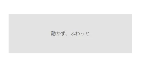
CSSのアニメーションのみで、テキストを入れ替える動きでメッセージを伝えるファーストビューアニメーション。
コーポレートサイトやブランディングサイトで理念やブランドメッセージの表現にぴったり。
HTML
<!--フォントの読み込み-->
<link rel="preconnect" href="https://fonts.googleapis.com">
<link rel="preconnect" href="https://fonts.gstatic.com" crossorigin>
<link href="https://fonts.googleapis.com/css2?family=Caveat:wght@400..700&family=Fredoka:wght@300..700&family=Playfair+Display:ital,wght@0,400..900;1,400..900&display=swap" rel="stylesheet">

<div class="mv mv3">
  <div class="mv3__img">
    <img src="/animation/wp-content/uploads/2026/01/img5.jpg" alt="">
  </div>
  <div class="mv3__txtBlk">
    <p class="mv3__txt01">I have</p>
    <p class="mv3__txt02">
      <span>love.</span>
      <span>courage.</span>
      <span>friends.</span>
    </p>
  </div>
</div>
CSS
.mv3 {
  height: 100vh;
  width: 100%;
  position: relative;
  background-color: #1E263B;
}
.mv3__img {
  position: absolute;
  bottom: 0;
  left: 0;
  width: 80%;
  height: 70vh;
  overflow: hidden;
}
@media screen and (max-width: 960px) {
  .mv3__img {
    width: 100%;
    height: 50vh;
  }
}
.mv3__img img {
  width: 100%;
  height: 100%;
  object-fit: cover;
  animation: mv3ImgAnime1 13s linear infinite alternate,mv3ImgAnime2 .3s ease forwards;
}
@keyframes mv3ImgAnime1 {
  0% {
    transform: scale(1.5);
  }
  100% {
    transform: scale(1);
  }
}
@keyframes mv3ImgAnime2 {
  0% {
    opacity: 0;
  }
  100% {
    opacity: 1;
  }
}
.mv3__txtBlk {
  position: absolute;
  top: 10%;
  left: 5%;
  font-size: 10vw;
  font-weight: bold;
  color: #fff;
  display: flex;
  column-gap: 0.3em;
  line-height: 1;
}
@media screen and (max-width: 960px) {
  .mv3__txtBlk {
    font-size: 14.5vw;
    top: 20%;
  }
}
.mv3__txt02 {
  height: 1.2em;
  width: 3em;
  position: relative;
  overflow: hidden;
}
.mv3__txt02 span {
  display: block;
  position: absolute;
  top: 0;
  left: 0;
  transform: translateY(-120%);
  font-family: "Caveat", cursive;
  font-weight: 400;
  font-size: 1.1em;
  animation: mv3TxtAnime 12s infinite;
}
@keyframes mv3TxtAnime {
  0% {
    transform: translateY(-120%);
  }
  10% {
    transform: translateY(0);
  }
  20% {
    transform: translateY(0);
  }
  33.3% {
    transform: translateY(120%);
  }
  100% {
    transform: translateY(120%);
  }
}
.mv3__txt02 span:nth-of-type(2) {
  animation-delay: 4s;
}
.mv3__txt02 span:nth-of-type(3) {
  animation-delay: 8s;
}
I have
love. courage. friends.


コメント