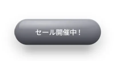
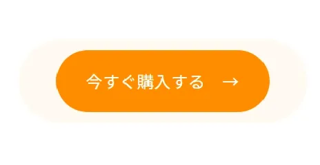
少し上級者向けのボタンアニメーション。
ループでバウンドし続けるアニメーションで注目をひくボタンに。
跳ねるボタンの動きかユーザーの視線を集めCV向上につながりやすい。
LPのCTAに圧倒的おススメのボタンアニメーション。
HTML
<a href="#" class="ugkBtnBounce3d">セール開催中 !</a>CSS
.ugkBtnBounce3d {
  position: relative;
  display: inline-flex;
  align-items: center;
  justify-content: center;
  width: 200px;
  max-width: 100%;
  height: 60px;
  border-radius: 100px;
  font-weight: 500;
  text-decoration: none;
  color: #fff;
  /* 立体感のベース */
  background: linear-gradient(180deg, #b0b0bb, #42424d);
  box-shadow: 0 16px 28px rgba(0, 0, 0, 0.22), 0 2px 0 rgba(255, 255, 255, 0.18) inset, 0 -10px 18px rgba(0, 0, 0, 0.18) inset;
  transform: translateZ(0);
  transform-origin: 50% 100%;
  will-change: transform, box-shadow, filter;
  animation: cta-3d-bounce 1.8s ease-in-out infinite;
  /* 本体:跳ねる+潰れる+少し前後に傾ける */
  /* ハイライト:跳ねで少し上下 */
  /* 影:上に行くほど小さく薄く、着地で広がる */
}
.ugkBtnBounce3d:before {
  content: "";
  position: absolute;
  inset: 3px 10px auto 10px;
  height: 55%;
  border-radius: 999px;
  background: radial-gradient(120% 80% at 30% 20%, rgba(255, 255, 255, 0.55), rgba(255, 255, 255, 0) 60%);
  opacity: .9;
  pointer-events: none;
  transform: translateY(0);
  animation: cta-3d-highlight 1.8s ease-in-out infinite;
}
.ugkBtnBounce3d:after {
  content: "";
  position: absolute;
  left: 10%;
  right: 10%;
  bottom: -14px;
  height: 16px;
  border-radius: 999px;
  background: rgba(0, 0, 0, 0.22);
  filter: blur(8px);
  transform: scaleX(0.9);
  opacity: .85;
  pointer-events: none;
  animation: cta-3d-shadow 1.8s ease-in-out infinite;
}
@keyframes cta-3d-bounce {
  0%, 70%, 100% {
    transform: translateY(0) scaleX(1) scaleY(1) rotateX(0deg);
  }
  12% {
    transform: translateY(-14px) scaleX(0.98) scaleY(1.02) rotateX(6deg);
  }
  22% {
    transform: translateY(0) scaleX(1.05) scaleY(0.93) rotateX(-4deg);
  }
  /* 着地で潰れる */
  32% {
    transform: translateY(-8px) scaleX(0.99) scaleY(1.01) rotateX(4deg);
  }
  42% {
    transform: translateY(0) scaleX(1.03) scaleY(0.97) rotateX(-2deg);
  }
  52% {
    transform: translateY(-4px) scaleX(1) scaleY(1) rotateX(2deg);
  }
}
@keyframes cta-3d-highlight {
  0%, 70%, 100% {
    transform: translateY(0);
    opacity: .9;
  }
  12% {
    transform: translateY(-2px);
    opacity: 1;
  }
  22% {
    transform: translateY(2px);
    opacity: .85;
  }
  42% {
    transform: translateY(1px);
    opacity: .88;
  }
}
@keyframes cta-3d-shadow {
  0%, 70%, 100% {
    transform: scaleX(0.95);
    opacity: .85;
    filter: blur(8px);
  }
  12% {
    transform: scaleX(0.75);
    opacity: .45;
    filter: blur(10px);
  }
  22% {
    transform: scaleX(1.05);
    opacity: .95;
    filter: blur(7px);
  }
  42% {
    transform: scaleX(1);
    opacity: .9;
    filter: blur(7px);
  }
}


コメント